Welcome

Welcome to my AS Foundation Portfolio blog. Here you will find research and planning, construction evidence and evaluation for my coursework project.

Wednesday 14 September 2011

Flat Plans


Front Cover:

This front cover page and contents page, were both designed by me as sketches for the real one. I decided to do this layout and colour scheme for so many different reasons, one of the main ones though is because of my Inspirational Pages, I designed my pages around these inspirational pages, so they they'll look very similar in design. For the 'Mast Head' I decided to stick to one bold and block colour, this is so it stands out and is very eye catching. Every weekly issue will have a different colour for the 'Mast Head'. I've decided for the front cover I am going to have one main image, which is medium close up, I've decided to only stick to one, so it draws in a lot of attention and there's no other distractions on the front cover, it will show a lot of detail close up. I have decided to use a goldy/yellow for the 'Skyline', this is so it stands out on the white background and also goes with the green 'Mast Head', this will also change colour weekly, but will always contrast well with the 'Mast Head'. This is at the bottom of the page. Other writing on the page will be in bold black, so it stands out well, with the white background and doesn't clash with the other colours. The 'bar code' is placed at the bottom right hand side of the page, this is so it's viewable but isn't getting in the way, as it would be annoying if it was placed in the middle page, ruining the 'Main Image'.
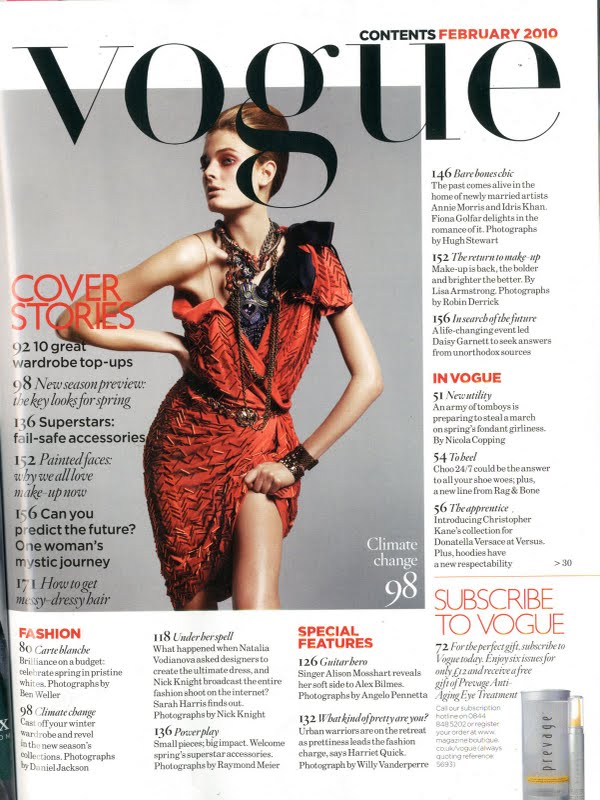
Contents Page:

The Contents page 'Main Title' is very similar to the 'Mast Head' on the front cover, just it's a smaller size. There's a main image in the middle of the page, which promotes the content of the magazine, on the right hand side, there is a 'Contents section' which shows what is going to be in the magazine, and what page its on. At the bottom of the page it has information on subscriptions, this is to be eye catching and to make people want to sign up for it. The layout of this page is very similar to my 'Inspirational Pages' I think it works well, how its laid out, the colours go well with each other as there the same as the ones on the front cover, they go so well with the white background.

Photography Composition

Tuesday 13 September 2011

Covers + Contents Pages Of Inspiration


Vogue Front Cover: 


Above are examples of magazine covers and there contents pages, that I am taking inspiration from for my prelim. The colours of the Vogue Magazine are great, there perfect for the month October, with the oranges and the deep blues, the colours also contrast well with the image, as they go with what she's wearing and the colour of her hair. I like the way they have set the layout for there magazine, the 'Mast Head' is always in the same place, big and bold at the very top, the only thing that changes with it is, the colour of it monthly. The 'Sell Lines' are bold and big, so it draws people in, so they'll want to read more and buy the magazine. The image use is very good, it's just one picture, so theres no her distractions to look at, apart from the main image, it's promoting. The image is of a medium close up, so all you can really see is her face an a bit of her shoulders, this is so it can show more detail of her face and what make-up she is wearing. The language of this cover is very 'English' based, as it says two things about English, such as 'The English Woman Now' and also 'Hometown Girl Goes Global' this is to draw you in, as you are from the same place so it's trying to stick to traditional sayings. I would say the positioning of the text and the overall design, is very simple, but classic, all of the 'Sell Lines' and there information, is in white, which makes it stand out on the dark coloured backgrounds, and then the 'Mast Head' and the main article which is being promoted on the front, are in the same colour, so this makes it stand out more. The positioning of the contents is set out great, as there all at the sides, so it's not blocking or ruining the main image on the front cover.


Vogue Contents Page:


Vogue's Contents page is very simple, but very eye catching at the same time. The 'Mast Head' of the page is the same as the main cover one, there's a main image and then there's 'Cover stories' on the left hand side and also 'In Vogue' on the right hand side, this is you know what is going to be in the issue. Down at the bottom is 'Fashion' and 'Special Features' and to the very bottom right the subscription for the magazine and what deals and savings you'll get with it. The colour of the contents is in black and then 'Sell Lines' are in Red, so they can stand out. There is an image of a model, which will be featured more of, once you read the magazine. I think the overall design and layout is well set out, its very simple but at the same time it works very well with everything all together. 


Glamour Front Cover:


Glamours front cover is very summery colours, which is very good since it's an August issue. The 'Mast Head' and a few 'Sell Lines' are in a bright blue and then other 'Sell Lines' are in yellow, they've done this so the colours stand out on the 'Main Image' so you can read them clearly. Overall the design and contents is set out very well, it all contrasts with one another and the image is set out very well, which is medium close up.


Glamour Contents Page:


Glamours content page stands out very well on the white background with the colourful 'Sell Lines' and 'Mast Head'. On this page there is: Entertainment, Fashion and Beauty and You You, theres also other 'Sell Lines' but these are my most favourite. They have also got on the left hand side at the bottom a competition for readers to enter, this is trying to draw you in, and also to buy the magazine. 


Monday 12 September 2011

Brief Print

Print Prelim Task
(AS Media Studies Induction)


Preliminary exercise using DTP and an image manipulation program, produce the front page of a new school/college magazine, featuring a photograph of a student in medium close up, plus some appropriately laid-out text and a masthead. Additionally you must produce a mock-up of the layout of the contents page to demonstrate your grasp of DTP. 


Main Task: The front page, contents, and double page spread of a new music magazine. a minimum of 4 images must be used. All images and graphics must be produced by the candidate.